It's been a while since I wrote anything about Photoshop, but don't be fooled into thinking my obsession has passed. Now that I'm taking so many close up shots with my new camera, my Photoshop adoration has only increased. Remember this favorite of mine that I
posted last time?
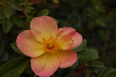
I loved the simplicity of the flower, the muted and delicate colors, the bits of dew on the petals. But I knew it could be better. Here's how it looked after cropping and using some Photoshop tricks.
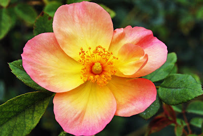
Wow, huh? Mind you, I didn't add or enhance any colors at all--just tweaked the contrast. Here's another favorite of mine from the day, this one taken by
Kelly.
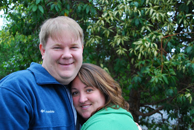
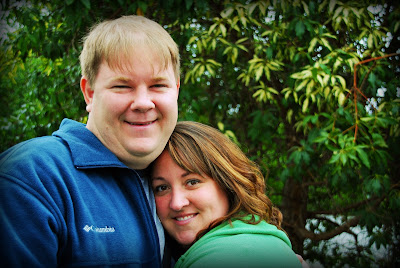
Everyone get it out of your systems and let out a collective, "Awh." Ok, moving on. This is a fab picture, yes, because my husband is The Most Adorable Man on the Planet and the way my face is nestled into him you can't even see my second chin. (Sigh.) But it's a little gray and blah in the color department. Know what I mean? This is no reflection on Kelly's photography skills, which I think we'd all agree are admirable. The grayish cast is just something you have to deal with in digital photography, or so I've read. But looky what happens when you move on over to Photoshop and adjust the contrast, correct for skin tone, and add a cool burned edge effect.
I've said it before and I'll say it again: I have so much fun experimenting with this thing that if you have a beloved photo you'd like to have enhanced, send it on over and I'll give it a go! Come on, don't be shy. But no boudoir shots, please. You know who you are.
 I loved the simplicity of the flower, the muted and delicate colors, the bits of dew on the petals. But I knew it could be better. Here's how it looked after cropping and using some Photoshop tricks.
  Wow, huh? Mind you, I didn't add or enhance any colors at all--just tweaked the contrast. Here's another favorite of mine from the day, this one taken by Kelly.
  Everyone get it out of your systems and let out a collective, "Awh." Ok, moving on. This is a fab picture, yes, because my husband is The Most Adorable Man on the Planet and the way my face is nestled into him you can't even see my second chin. (Sigh.) But it's a little gray and blah in the color department. Know what I mean? This is no reflection on Kelly's photography skills, which I think we'd all agree are admirable. The grayish cast is just something you have to deal with in digital photography, or so I've read. But looky what happens when you move on over to Photoshop and adjust the contrast, correct for skin tone, and add a cool burned edge effect.
  I've said it before and I'll say it again: I have so much fun experimenting with this thing that if you have a beloved photo you'd like to have enhanced, send it on over and I'll give it a go! Come on, don't be shy. But no boudoir shots, please. You know who you are.
3 comments:
Sorry, but I have to say it again...
Awh!
:-D
Great tweaks! Both were taken from good to great.
Those are AMAZING tweaks. Seriously, you have a talent for seeing what needs to be improved-on. WOW.
I love that pic of you and Matt too! (I even said so on Kel's blog) :) And congrats on the new fixture...I agree, it was time. :)
Post a Comment